2013-12-24 10:18:50
Before & After: South of France's Modern Look
2013-12-24 10:18:50
By Marie Redding, Associate Editor
|
|
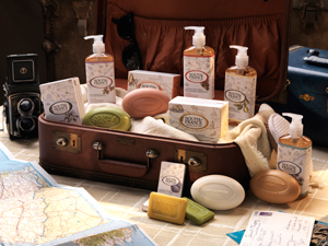
When South of France Natural Body Care decided to redesign its look, the goal was to reinforce its French heritage and create packaging that would be giftable.
“I wanted to take the brand’s look to a new level,” says Victoria Neilson, the company’s vice president and general manager.
Manufactured in the USA by Good Health Natural Products, in Greensboro, NC, the original South of France soap formula was developed in 1999 by a French expatriate in the US. Today, South of France soap is still kettle cooked in small batches using this traditional Marseille recipe with all natural vegetable ingredients.
Neilson says she wanted to reach consumers that were driven by great packaging and great fragrances, which is unique in the natural product market. “Traditionally, most natural brands are driven by primarily by a natural ingredient story. The fragrances for natural products tend to be one-dimensional – mainly essential oils – and the packaging is basic. These brands are ingredient-driven, but not emotionally driven – and South of France has always been both,” she says.
The New Look
|
|
|
|
 BEFORE: South of France's old square bar soap, with a plain wrapper - it wasn't giftable.
“We based the design on the experience of a leisurely journey through the South of France, to highlight the brand’s indulgent formulas and French heritage. We wanted the graphics to tell a story – and not just yet another ingredient story. The image also had to convey ‘gift-ability’,” she explains.
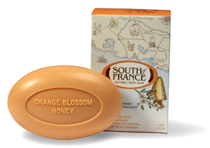
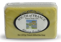
The soap’s outer packaging was changed from a plain wrapper with a single icon to a folding carton decorated with a map of the South of France – to reinforce the brand’s tagline, “where will we take you today.” “The cartons had to offer a compelling image,” says Neilson.
To make sure the cartons felt special, they have a silky, soft touch finish. “It’s unusual to use this on a carton in the natural channel, which is usually self-service – most brands do not use cartons, instead, putting all the bells and whistles on a bottle or tube, but the experience of buying soap is different because the carton is usually the first part of the package the consumer touches,” Neilson explains.
Neilson says she watched as shoppers picked up boxes of soap in the store, to smell the scent – so she wanted to make sure the carton felt as luxurious as the fragrance itself. To allow shoppers to easily smell the fragrance, there are die-cuts flanking the brand’s logo on both sides of the box.
Each of the 12 fragrances has its own icon, represented on both the front and back of the carton which is designed to be displayed vertically or horizontally. The cartons are recyclable, and made with FSC-certified paperboard.( looking for lipgloss tube packaging?)
New Shapes
|
|
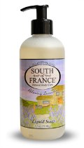
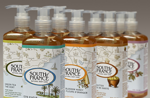 AFTER: South of France's hand soaps were modernized with new oversized pumps, square bottles, and a label decoration to macth the graphic on the bar soap boxes.
The shape of the soap itself was also changed – from a rectangular bar to an oval.
“The old soap shape was a traditional, thick rectangle – but we got feedback from consumers that it wasn’t easy to hold in the shower and often didn’t fit in the U.S. shower stalls that usually have a scooped-out oval shape soap dish,” says Neilson. “The pampering effect of our all-natural triple-milled formula, prized for its creamy, moisturizing and high performing lather, is now enhanced by the indulgent new oval shape that is now also hand-friendly,” she adds.
In addition to bath bars, South of France also markets hand soap in plastic, BPA-free bottles with pump dispensers. These were changed from frosted round bottles to clear square. “Customers love to see the color of a product inside a bottle,” says Neilson. She adds, “The bottle shape was important. It had to feel good in the hand, and also work with the look of the carton.”
Plain black pumps were changed to a more user-friendly, modern style that’s oversized and frosted. (These are featured in Beauty Packaging’s December issue, Deciding on a Dispensing System.) Berlin Packaging produces the bottles and pumps. (looking for eyeliner packaging?)
|
|
 BEFORE: South of France's hand soaps were in plain round bottles with small black pumps.
The labels on the bottles match the graphics on the soap’s boxes, and were produced by Flexo Impressions. “It was a challenge to match the graphics on two different substrates, while working with two different suppliers,” explains Neilson. “We worked hard to make sure the graphics really translated well on both packages – and to make sure they didn’t end up looking like they came from two different places,” she adds.
New Scents
When Neilson first started the redesign project, the brand had been launching new fragrances that were on trend – but they didn’t always go with the brand’s DNA. (looking for eye shadow case?)
To continue to reinforce the brand’s French heritage, five new fragrances were created to evoke the experience of traveling through the brand’s namesake region. “We’ve always been a leader in innovative fragrances – now we’re drawing more from our heritage by developing unique, complex fragrances such as Cote d’Azur, that captures the scent of swaying palm trees and rich olive trees infused with the salty tang of the Mediterranean sea air,” says Neilson.
The collection now features a total of 12 fragrances in 4 categories: Floral, Herbaceous, Fresh and Gourmand.
The brand’s floral fragrances include its original Lush Gardenia, plus the new Blooming Jasmine, Climbing Wild Rose andLavender Fields. Herbaceous fragrances include Lemon Verbena and new fragrances Côte d’Azur and Herbes de Provence. Fresh fragrances include Green Tea and new addition Mediterranean Fig. Gourmand fragrances include Shea Butter, Almond Gourmand and Orange Blossom Honey.
LinkedIn


