2014-01-15 20:55:02
Before & After: Good Design Is in the Details
2014-01-15 20:55:02
By Marie Redding, Associate Editor
|
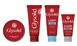
 AFTER: Glysolid's New Look - after the redesign. AFTER: Glysolid's New Look - after the redesign.
|
When a brand has been around for a long time, it’s a designer’s job to instantly recognize which aspects of its image need to be kept – and which have to be updated.
Such was the case when the team at the international design consultancy Casa Rex, which has offices in São Paulo and London, was asked to redesign the classic Italian brand, Glysolid. The brand’s new look seems similar at first glance—especially to the consumer—but to an experienced designer, the slightest graphic elements have a major impact in being able to effectively communicate with consumers.
looking for lipstick tube packaging?
Gustavo Piqueira, head of Casa Rex and the creative director of the project, describes Glysolid’s new look: “The new brand structure is iconic and distinctive, suggestive of its traditional red jar, which creates a strong identity that maintains its classic appeal.”
During this redesign, no detail was overlooked—and even the subtlest details were important. The team at Casa Rex knew that Glysolid’s typeface needed an update.
“We used a new modern typeface with rounded corners and a smooth ‘y’ termination to introduce more femininity,” explains Piqueira. “New aspirational visuals highlight the individual functional benefits of each product, creating strong differentiation and introducing a softer look and feel that is much more aligned with contemporary visual codes.”
|
 BEFORE: Glysolid's Old Look - before the redesign. BEFORE: Glysolid's Old Look - before the redesign.
|
Why are these details so important in conveying a brand’s image?
Looking for Compact case?
Piqueira says that graphic design is a direct reflection of a certain time and place and it needs to be current, to speak most effectively to consumers.
“When we say a brand ‘feels’ outdated, it is because its image is no longer in tune with its contemporary customs and, of course, visual codes,” he says, adding that the same goes for fashion. “The jeans style that used to be modern in the ’80s for example, is certainly not seen as modern today. But of course, people haven't stopped wearing jeans—it’s the details that have changed, like the cut, color, textures etc. Sometimes the key to sending out the right message is indeed in the subtleties.”
Similarly, Piqueira says that Glysolid’s old logotype might have once been capable of reaching its consumers—in another time. He explains, “It carried a “romantic ’80s cosmetics feel. But for today’s visual standards, it could never be perceived as modern—and this was the change that the new typeface needed to convey.”
However, Piquerira also stresses the importance of knowing when certain elements of a design shouldn’t be changed, especially when the brand is a market leader.
“As in the jeans example, Glysolid’s overall aesthetic wasn't going anywhere—it had to be kept. It is a true icon. So, the secret in moving from its ‘outdated’ appeal lay in the details.”
He says, “By combining the contemporary edge of a more minimal and functional sans-serif font with subtle and modern stem adjustments, such as its rounded finishes and smoother ‘y’ termination, the brand was brought closer to today's cosmetic visual codes, and ultimately presented an image fit for Italian women's current aspirations.”
Looking for eye shadow case?
Glysolid’s old design included a logo with the tagline, “In buone mani. Dal 1978," which translates to “In good hands. Since 1978.” But Piqueira says the hands depicted in the logo needed to be changed because they were a figurative illustration. “They were posed vertically almost as a 'stop' sign—which didn't feel cosmetic—and the icon presented too many flourishes, rendering it visually cluttered, and with an overall vintage aesthetic,” he says.
The new modernized icon preserves its serif typeface, but Piqueira says it has more refined terminations. “It loses its bulky feel while maintaining a touch of nostalgia from the previous design. The excessive flourishes were also removed—and now it evokes sensuality and femininity, holding the tagline within its palm, which is a much more expressive symbol.”


