2014-04-12 23:55:37
Jane's Instagram-Inspired Look To Attract Millennials
2014-04-12 23:55:37
By Marie Redding, Associate Editor
|
|
Jane Cosmetics has been reinvented, for a new generation of millennial consumers.
Financier/CEO of Patriarch Partners, Lynn Tilton, who is also the owner of Stila Cosmetics, wanted to bring back the iconic brand from the 90s – and turn it into a success. Tilton is now owner/CEO of Jane Cosmetics, and leads the team that’s reinventing the brand.
Jane Cosmetics consists of high quality formulas, targeting women who want to experiment with color and try a wide range of shades at affordable prices. The products have all been redesigned and reformulated, and the ‘masstige’ brand is being promoted through social media channels.
|
|
Jane Cosmetics is sold online, as well as at Ulta, Kohl’s and Stage Stores in the US. “Since the brand is sold on self-service merchandising units, the challenge was to create a packaging concept that would communicate its messages, and its reinvented story on the packaging,” explains Jill Tomandl, chief creative officer for Stila and Jane Cosmetics.
‘Friends of Jane’ Are Making a Difference
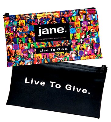
Adorned on the packaging are the faces of the ‘Friends of Jane’ - socially conscious women who founded charities to help women in need.
“Millennials want to make a difference, so Jane allows them to show support for these women,” says Tomandl.
Each package is printed with a message referring consumers to the Jane website to learn more about the ‘Friends of Jane,’ and the charities each woman represents. “They’re our brand ambassadors,” says Tomandl. “By placing them on the packaging, we’re giving visibility to each of these remarkable women’s stories and the charitable organizations which they support,” she adds.
The brand has also made a donation to each charity – and 100% of the net proceeds from the sale of the Jane ‘Live to Give’ Makeup Bag will be donated to charity.
The nylon bag is printed using a 4-color process for photographic image clarity and color accuracy, according to Tomandl. “The hang tag is also printed with the brand message,” she says.
Using Lomography to Create the Colorful Images
The colorful photos of the ‘Friends of Jane’ signify the brand’s tagline “confidence comes in many colors,” according to Tomandl, who says that young women relate to the Instagram-style photography on the packaging.
|
|

The images were created using lomographic imagery, which features unique lighting effects, vignette framing and richly saturated colors. “The photos were shot with a Lomography Colorsplash camera using 35 mm film. The color-wheel flash projects the selected wash of color over the image – and eight rainbow color gel filters were used to represent each color of the spectrum,” explains Tomandl.
She adds, “The photography inspiration came from a friend, Liad Cohen, an award-winning lomographer.”
|
|
The women that were photographed are holding a flower, which symbolize “an act of kindness.” “Since we were shooting ‘real’ women, not models, the flowers made the photo shoot more interactive and fun,” says Tomandl.
Minimalist Black and Clear Components
The colorful photos pop against the brand’s black and clear packages, which all have a minimalist look. “Every color looks good next to black, which is the perfect background for the colorful imagery,” says Tomandl.
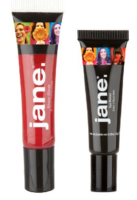
The line contains a lot of tubes, for ease of use and portability. Jane’s lipgloss is packaged in clear tubes with angled tip applicators, and decorated with heat transfer labels.
“The shades and shimmer levels are visible to consumers, which is critical in an open-sell environment,” says Tomandl. “The heat transfer labels allow for photographic image clarity and color accuracy,” she adds.
Jane’s BB Cream with SPF is in an opaque tube, decorated with a label that features a shade indicator, color-matched to the product color. The eyeliners in the collection are sold in colorful, molded plastic components that are color-matched to the shades inside.
The Cheek Color, Illuminator, Bronzer, and Color Corrector all have designs that are displayed in clear compacts. “These products were created with a multi-press tool, and embossed with a bouquet pattern. The Eye Shadow is pressed with a single flower design in the embossing tool,” says Tomandl.
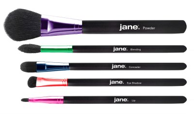
Even Jane’s brush handles are colorful. “The brush ferrules are anodized with each color in the rainbow to create visual impact,” says Tomandl.
Designing for the ‘Giving Back’ Trend?
Perhaps we’ll soon see more ways in which social media is influencing the look of packaging – plus, more brands promoting ‘giving back.’ But the bigger trend that Jane Cosmetics might be igniting seems to be innovative designs that draw attention to worthy causes, and women who are making a difference.
LinkedIn


