2014-05-26 07:16:44
Before & After: Belli Trades Apothecary Elements for a Bolder Deco
2014-05-26 07:16:44
By Marie Redding, Associate Editor
|
|
Belli Skincare has recently re-designed its packaging – switching from apothecary-style fonts and decorative elements to a bolder, more contemporary look.
Belli’s products are all physician-formulated, and manufactured by Enaltus LLC. The new packaging has a clean, contemporary look – sure to fulfill the brand’s goal of reaching a broader consumer market.
Redesigned & Repositioned
Belli Skincare was originally named to attract the attention of expectant mothers. Since the redesign, the brand is repositioning itself – hoping women will see that the product line will meet their needs during pregnancy, motherhood, and beyond.
“Women often discover Belli when expecting. But they also discover what these exceptionally pure and elegant formulas can do for their skin, and adopt them as part of their permanent beauty regimen,” says Martin Floriani, CMO EVP, Enaltus.
The Formulations
The products don’t contain any harsh chemicals, and every ingredient undergoes an extensive review process. Ingredient choices are based upon published medical studies, and its products are allergy tested, free of artificial dyes, fragrances, phthalates and paraben preservatives. This often appeals to pregnant women as well as new moms looking for products that are more natural.
|
|
Belli also goes a step further and has implemented a unique safety screening process for its ingredients, ensuring that no ingredients with known links to birth defects or harmful effects while breastfeeding are used in its formulations.
“Women appreciate the rigorous screening process that eliminates any ingredient with even a remote link to birth defects, miscarriage or other problems of pregnancy,” says Floriani.
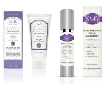
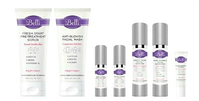
The New Look
Belli’s new look is clean, stylish and understated, with bolder decorative elements. The graphics are more eye-catching and the purple hue is bolder. The brand’s logo pops against the new oval band. Silver foil accents the outline of the band. “The silver foil accents were achieved through hot-stamping,” adds Floriani.
|
|
Each product’s name and function is featured ‘front and center’ on the new packaging. Words like Prep, Cleanse, and Treat are used in the product names to clearly convey product uses. They are easily readable in large capitalized text, while the product benefits and key ingredients are highlighted in vivid pink.
“The new design scheme gives the products an impressive shelf presence, as complimentary skin care steps for face and body,” explains Floriani. “The new fonts for the product names and functions are much easier to read, and self-explanatory now, as steps in a skincare regimen,” he adds.
Packages that Offer More Functionality
In addition to changing graphics and other decorative features, Belli updated some of its products by choosing different types of packages.
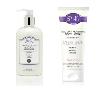
For instance, Belli’s body moisturizer was switched from a bottle with a pump dispenser to a more convenient tube. The brand’s facial sunscreen’s tube was swapped for an airless bottle.
The End Result
Sometimes it’s difficult for a brand to decide whether to make such noticeable changes all at once – but the team at Belli is happy with the decision – and knew it was time for a redesign. The brand’s new look was conceived through collective input from the brand’s sales and marketing teams, and the project was executed in-house by its graphic designer.
“As part of the design process, we received feedback from both our customers and retailers. We took into account all of the pros and cons of a design change, and in the end, sought a fresh upscale look. This ultimately improved how the packaging appears, both on shelf and online,” explains Floriani.
Often, a new look is all it takes for a brand to reinvent its image, and Belli is happy with its outcome. “Overall, we have been hearing that consumers like the look, and retailers are finding the layout to be more cohesive,” says Floriani.
He adds, proudly, “We have been receiving a lot of positive feedback from all of our retail accounts, as well as directly from customers, which feels great.”
LinkedIn


