2014-05-26 07:18:33
Packaging That’s All in the Family
2014-05-26 07:18:33
A strong marketing message might be a pivotal piece in an overall marketing campaign, but in the thick of in-store and online retail environments it’s the packaging that draws the consumer’s eye. A brand collection tied together by cohesive packaging not only cultivates a brand harmony, it also forges a more memorable brand presence.
“Brands need to present a strong unified look to attract the consumer in a more sophisticated way,” says Jackie Mantle managing director, HCP Packaging, Bournemouth, UK. “Strong competition for shelf displays and space means that the brand communication is more important than ever as the consumer becomes better educated through digital communication and e-commerce.”
|
|
rafting a unified family of packaging can be achieved in different ways. Generally, the first route entails the use of similar primary packaging, either stock or custom-designed. The second involves the use of finishing and decorating techniques to customize a look.
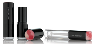
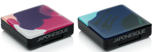
HCP recently collaborated with Japonesque to create customized packaging for the fall 2013 launch of its new color cosmetics range. The 10-product, 72-SKU line showcases HCP’s patented Gelology technology, which blends multi-colored epoxy resin and color pigments into gels that are applied to packaging, then cured to deliver a long-lasting shine.
Born out of a desire to create a unique, artist-inspired collection, the Japonesque Colour line evolved out of the concept that every single item in the beauty line would have a personal, individual signature. Though the line appears visually unified, HCP’s Gelology technique rendered every color-swirled compact and component to be one-of-a-kind, and no two items are absolutely identical.
“The product categories within the range are identified through the unique blend of gel pigments within the Gelology color grouping,” explains HCP’s Mantle. “The eye products utilize a unique color swirl mix of blues; the lip category has been developed with pale and deep pink gel tones; while the face category uses a different mix of richly pigmented gel tones.”
Each gel finish was completely hand-generated to create uniquely individual “works of art.” After the Gelology resin is applied and cured, the components are screen printed in one pass.
Customizing Stock Packaging
Not every brand is able to take a custom packaging route. That’s where stock packaging comes in.
|
|
“Having a particular actuator or bottle style associated with a brand helps with loyalty and recognition with consumers,” says Alexander Kwapis, creative director, Fusion Packaging, Dallas, TX. “Stock collections with a wide variety of capacities, diameters and pump options, afford beauty companies the opportunity to try out different sizes and shapes that still have a unified look.”
The Lift and Eclipse packaging collections from Fusion include sizes ranging from 5ml “minis” to 100ml “jumbo” packages, with interchangeable bottles and over caps that enable brands to “mix and match” between the two collections for a uniquely customized look.
Working from an existing collection of packagingcan be a great resource for brands in search of an interconnected packaging configuration that’s budget-friendly. “This allows brands to grow, because they can launch with a few select products to first see what works, and then grow using the same actuators on different bottles or tubes,” comments Kwapis.
Decorative techniques are another popular way packaging suppliers can help brands achieve a unified look. “We often use decoration to make different package collections look like one cohesive brand using coordinating colors, shapes and techniques like custom color sprays, vacuum metallization, injections, heat transfer labels, and silkscreen or hot stamp decoration,” Kwapis says.
|
|
For its Visible Difference line, Elizabeth Arden selected packages from Fusion’s Wish and Axis collections. Despite the packaging collections having distinct visual differences, the product range was tied together using a matching white color injection, paired with a vacuum metallized collar and base. Both of the line’s airless bottles feature silkscreen decoration that includes the brand’s iconic Red Door logo. The resulting packages blend seamlessly into the brand’s existing product family.
Kwapis credits Fusion’s vertical integration as the key to exercising precise control over the arduous task of creating packaging and componentry for a multiple product line. “We are able to oversee the entire packaging process—from engineering and manufacturing to decoration and labeling,” he says. “Every curve, every color and every millimeter matters.”
In addition to packaging, the Fusion Design Studio specializes in color theory and develops colors that brands can use as proverbial design springboards. This was the case for Peter Thomas Roth’s Laser-Free Resurfacer, which is packaged in a richly colored, 30ml Allure bottle. The unique color was later echoed in other packages in the line. “We created a deep red color to depict one of the key ingredients in the product line, Dragon’s Blood Complex,” Kwapis explains. “For this package, we also used decorative techniques to match the shiny metallic look on the actuator, collar and overcap—each of which was made from different resins. The end result was a seamless, bold package.”
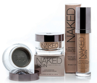
This use of color theory also helped transform stock packaging to unify Urban Decay’s new Naked Skin line. Using the FusionMatch Color Technology, Fusion coordinated the brand’s signature gunmetal color into both its Weightless Ultra Definition Liquid Makeup (packaged in a 30ml Allure bottle) and its Ultra Definition Loose Finishing Powder (a custom-designed 30ml jar).
Fusion also created a mini version of the foundation bottle using its 15ml Fresh airless package. “Through thoughtful metallization and spray decoration, we were able to make products from three of our stock collections, all of different sizes and shapes, look cohesive and fit effortlessly into the existing Naked Skin family,” says Kwapis.
|
|
More recently, Fusion injected its 30ml Allure jar with a custom translucent amber color for the Dr. Dennis Gross Skincare brand. The technique successfully replicated the look of the glass bottles they were already using, and gave a uniform look to the Ferulic + Retinol product line. Kwapis says the final product had an apothecary appeal that both teams loved.
“Consumer perceptions are greatly affected by primary packaging, as it can provide intrinsic cues [about] the DNA of a brand,” says Curt Altmann, vice president of global development, Yonwoo/PKG, NY. “This is why a unified theme, whether it is the shape, and/or graphics of primary packaging is so crucial to brands, especially those with a strong personality.”
Altmann says Yonwoo/PKG offers a wide range of decorating options for brands to express their unique personality on a standard package, including metallizing, colorful/textured spray coatings, silkscreening, hot stamping and heat transfer labels. “With this array of options, we are able to duplicate any brand’s graphic look,” he says.
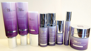
Yonwoo executed the packaging for Valeant’s PRO+ Therapy skincare range. The company started with round and oval tubes that were accented by pearl, four-color offset printing, and shiny silver hot stamping. The line also includes a 20ml similarly decorated, white, molded airless bottle that’s capped off by a silver metallized pump shoulder and a matte silver hot stamp on top of the cap, and a silver vacuum metalized collar and over cap.
The company also produced the packaging for Kirkland Signature Borghese skincare products, which started with 30-, 50- and 100ml Softbody airless bottles, 100ml Softbody dip-tube spray bottles and 50ml Softbody jars. “All items were molded white with gun metal vacuum metallizing or gun metal anodizing with PMS-8403 silk screen,” says Altmann. “The 30ml Softbody foundation bottle was clear with white gradation spray with PMS-8403 silk screen.”
Line Extensions: Welcome to the Family
|
|
So you have an established product range and now you want to add a new product to the existing family: This is another instance where coordinated packaging is the ideal solution to help integrate a new SKU into the fold.
“Packaging with a unified theme is especially important for product line extensions,” says Eileen Wang, vice president of sales and marketing, Allstar Packaging, East Brunswick, NJ. “A well-designed package, through the shape, the color, graphics, etc., can have a strong impact on the consumer’s brand recognition. Add to a well-recognized brand by utilizing a unified theme for the packaging, and several benefits may be achieved all at once: It can allow the value of the brand to carry over to the new additions with less hassle; it can help the consumer to more readily accept a new addition; and as more products are added to the line, the consumer, having more exposure to the same appeal, generates more intense and long-lasting brand awareness.”
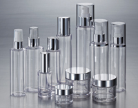
Wang says Allstar groups the family of packaging by shape and material. “Different materials may generate different visual impressions,” she says. “For example, a PET family allows the beautiful color of the product to show through the water-clear bottles and jars. Polypropylene and polyethylene, especially with a soft touch layer, on the other hand, convey a softer and gentler image.”
Keeping the potential of the brand extension in mind, Allstar maximizes the available sizes in each family of its stock containers, which range in size from 15- to 250ml in most of the groups. “The wide range of sizes allows the entire product line, the saleable sizes of skin treatment, body and hair products, as well as the sampling and trial packages, to have a consistent style across the board,” she says.
The brand extension has a chance to bring in new products of very different characters from the existing one. Allstar keeps a good variety of pumps, sprayers, and caps in the line. The clients may use the same bottle for multiple products to keep the uniform image while choosing a closure, pump or sprayer geared to a particular product.
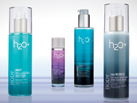
Allstar also uses decoration to bond the product families together while at the same time distinguishing them from other products competing in the same market segment. This is commonly achieved via custom colored molding, spray coating, anodizing for metal parts, screen printing, etc. This is best illustrated in work the company recently executed for the personal care company, H2O Plus. Allstar transformed a clear family of PET bottles and jars into a distinctive packaging collection using customized pearlescent gray caps to echo the metallic matte silver collared pump. The design also featured elegantly designed labels.
Turnkey packaging programs are another alternative that can supply brands with the opportunity to coordinate packaging across a variety of platforms using the same design, color and decoration.
“Smaller companies can benefit from working with one supplier who can offer a lower cost based on their purchase of more than one container,” says Lou Della Pesca, president, 3C Inc., Wyckoff, NJ, a turnkey packaging supplier that offers a full range of packages for the color cosmetics, bath and body, treatment, personal care, pharmaceutical and hair industries, as well as decorative capabilities spanning silk screening, pad printing, hot stamping, transfer film or UV coating and metallizing.
To help a line achieve a unified family look, Cospack America Corp., Edison, NJ, offers an extensive range of package sizes plus carefully selected coordinating items on some of its more popular packaging. “We also work with the brand’s creative team to integrate decoration options such as silkscreen, spray coating, etc., in the overall packaging design to enhance cohesiveness within the line,” says David Hou, the company’s director of marketing and sales.
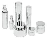
Cospack’s recently launched Prestige Collection, comprised of metal accented components and spray metallized plastic and glass components, allows brands to button up their product lines with a consistent metallic look. “The anodized metallic look has been popular over the last few years in the beauty industry; however, since many existing packages are not made with an actual metal finish, we developed a decoration technique that can achieve a metallic spray coating on plastic and glass surfaces that closely mimics an anodized metal finish,” Hou explains. “This ability to achieve a matching metallic look on non-metal packaging allows us to offer clients a wider range of options and not be limited to only metal packaging.”
Mike Warford, director of sales, ABA Packaging, Holtsville, NY, says it has never been easier for brands to coordinate and unify their product lines, thanks to an ever-evolving array of creative packaging and decorative options. “The main benefit for brands that use a unified theme is line identity and brand recognition,” he says, noting that the look and theme conveys the brand’s story to consumers. “Having similarities in the geometry of the primary packaging components is often an area that designers favor for a unified look.”
LinkedIn
