2014-06-07 22:49:01
A Sudden Wash of Watercolor
2014-06-07 22:49:01
Watercolor-inspired designs are on the rise. Although the medium has been widely used in marketing over the decades and has popped up at various times in many categories, watercolors seem to be making a sweeping resurgence.
Brands around the globe are applying brushes to a wide range of communication including print, packaging, and digital design, and incorporating these fluid and luminous creations.
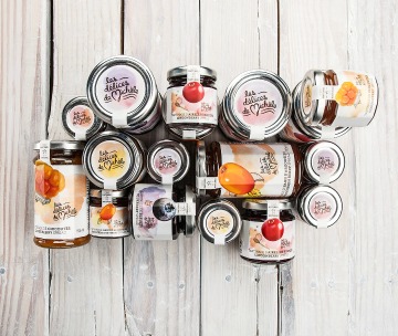 Les Délices de Michèle – a brand of authentic sweet treats from Quebec - highlights North Shore berries as their key ingredient and claims to awaken the taste buds. |
So why the sudden wash of watercolor? What is it about this classic medium that’s so appealing today?
From a purely visual standpoint, watercolors have a brilliance and clarity that other paints can often lack. This is largely due to the fact that they are transparent and get their color from light bouncing off the paper behind them. As a result, watercolors look as if they are lit from within.
The medium is also dependent on the spontaneous behavior of water itself, which creates lines, shapes, and shades that are uniquely fluid and organic.
From a communication perspective, these combined visual effects convey warmth, originality, and craftsmanship. The medium naturally lends itself to capture the essence of ideas rather than realistic detail, which, in turn, engages the imagination. One can start to see how watercolors’ unique strengths can complement certain marketing messages and be an effective way to connect with consumers today.
Print
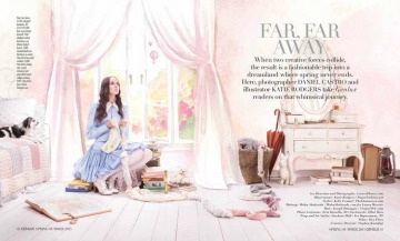
Photography and illustration are combined in a recent editorial for Genlux, a magazine devoted exclusively to luxury and beauty. Entitled “Far, Far Away,” the final art seamlessly blends real models and fashion items with watercolor backdrops to create a tour through fantasy locations. The watercolors distinctly conjure the richness, creativity and playfulness associated with children’s storybooks and accentuates the style of the apparel.
Artist Kareem Iliya has been commissioned by an impressive list of
 Photo by Genlux magazine |
global luxury brands, to bring their products to life through watercolor. Her works have been featured in publications worldwide including the NY Times, W magazine, Harper’s Bazaar, the New Yorker and Vogue. Her watercolors are elegantly simple, one-of-a-kind interpretations of icons; each underscoring the brand’s distinction, beauty and craftsmanship.
Packaging
CPG brands globally are embracing watercolors and their unique way of
 Ads featuring watercolor illustrations are a trend. |
resonating with consumers by incorporating the style in illustrations and package design. While some employ calm, subdued splashes of color, others seem to be adding a fresh spin with super-saturated, vibrant punches.
Both approaches reinforce the products’ hand-made / crafted / premium aspects. While white packaging has been a popular trend in recent years, it risks appearing sterile or generic. However, watercolors complement white particularly well – the white becomes the perfect “canvas.”
Artist Kareem Iliya has been commissioned by an impressive list of global luxury brands, to bring their products to life through watercolor. Her works have been featured in publications worldwide including the NY Times, W magazine, Harper’s Bazaar, the New Yorker and Vogue. Her watercolors are elegantly simple, one-of-a-kind interpretations of icons; each underscoring the brand’s distinction, beauty and craftsmanship.
Packaging
CPG brands globally are embracing watercolors and their unique way of resonating with consumers by incorporating the style in illustrations
 A new iPhone app called Waterlogue replicates the actual painting process. |
and package design. While some employ calm, subdued splashes of color, others seem to be adding a fresh spin with super-saturated, vibrant punches.
Both approaches reinforce the products’ hand-made / crafted / premium aspects. While white packaging has been a popular trend in recent years, it risks appearing sterile or generic. However, watercolors complement white particularly well – the white becomes the perfect “canvas.”
Web
Web designers have been adopting the watercolor style too, and for good reason. Watercolor is a great way to add depth and color. While websites can often be content heavy and complex, watercolor can give a site an original, authentic feel and a necessary light touch that distinguishes it from the competition.
Watercolor in web design is popping up in a variety of ways; whether it’s the main graphic of the site for big impact (e.g. Evolution Fresh) or used for more subtle and unexpected details. It engages visitors, which can help hold attention and drive sales.
What Does This Mean For Marketers?
As the examples show, when used right, the brilliance and spontaneity of watercolors can engage an audience with a look that’s lively, warm and original. They can capture a consumer’s attention and imagination, while bolstering the craftsmanship of a product. They can accentuate a brand’s essence and differentiate it in a highly competitive landscape.
However, watercolors aren’t for everyone. Marketers need to carefully consider a brand’s attributes and personality to determine if they align with the natural strengths of this art medium.
LinkedIn


